The #1 Secret to Getting More Customers From Your Website | CRO Explained
If you’re like most business owners, you really don’t want to ‘know’ what it takes to make a successful website that converts visitors to customers because you want to focus on running the business. Time is short! The marketing (and tech) side of running a business can be extremely difficult and time-consuming to figure out – you probably just want it to WORK, without knowing the details!
A big issue with many web design companies, though, is they don’t really care about getting you customers. They just care about their pretty design. So, in this article we’ll discuss what the majority of web design companies will say is needed for your website, and why what they say is NOT what you really need for your business website!
But, what IS the Number One Secret to Getting More Customers From Your Website? After all, you could literally spend a million dollars (if you had it to spend!) sending visitors to your website, right? But if those visitors don’t get what they want from it or if something is awry or off on your website and they detect it, hardly any of them will buy from you!
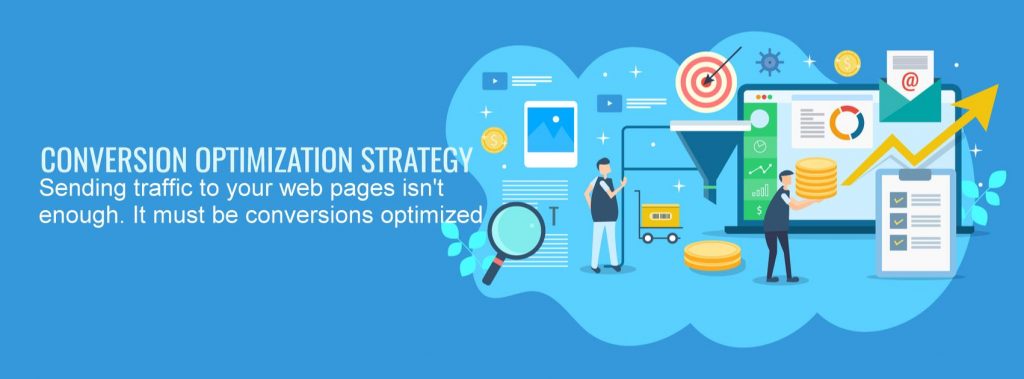
So here it is – THE NUMBER ONE SECRET – Conversion Rate Optimization. Now you may be wondering, what is a conversion rate? Glad you asked!!
What IS a Conversion Rate?
The conversion rate is the percentage of your first-time website visitors that actually become customers (or clients, or patients, or whatever term you use for the people that pay you for your products and services) at some point in time – preferably sooner than later. It doesn’t matter how they got there – it just matters that they GOT there.
Ideally, you want this percentage number to be as high as possible. After-all, you AND your marketing worked really hard (and most likely paid a lot of money) to get those visitors there to begin with, right? Why not look into this cool thing called Conversion Rate Optimization and see if you can convert MORE of those visitors to pay you for your products and services?
First, it helps to know where you stand regarding your conversion rates. It’s important to know that conversion rates vary by industry. Those rates vary widely but are generally between 1% (1 out of 100 visitors converts) and 10% (1 out of every 10 visitors converts) with the average being around 3% (about 1 out of every 33 visitors). However, some companies convert at much lower or much higher rates.
To compare rates, you have to know what your current conversion rate is and then compare it to your industry average. And do know this – if you’re average, you’re not good enough because this means there are companies out there that are converting at MUCH higher rates.
And What’s Conversion Rate Optimization?
Conversion Rate Optimization (also known as CRO for short) is a method of changing elements on the web page so people become more enticed about purchasing from your company.
Examples of these elements include:
- Text – what it says and how it relates to your business AND your visitors, the font (also known as typestyle) used, how big or small it is, what color(s) it is, where it’s located on the page, etc
- Images – the colors used in the images, what the images represent, whether they have frames, how big or small they are, etc
- Overall layout of the page: most people have a natural direction of reading, so the most important points need to come first in the direction being read, with less important points and explanations coming afterward
- Call to Action (CTA) – how many on the page, location, color, etc
- Optimizing for page speed – every second longer that each page on your website loads compared to competitors is a potential customer percentage loss
- Adding things like live chat that helps keep visitors engaged and knowing that a real person is really on the other side that cares about their needs and desires
- AND – properly testing each of those changes against either other changes and/or the previous design(s) to see which converted better. This is called A-B split testing. Here’s additional info from Wikipedia on CRO
Although, this article will not go into all the scientific and experimental details of CRO (because it’s quite complicated and lengthy to explain, and is a subject for another time), the point is that CRO is the ONE thing your website needs to be as successful as it possibly can be.
Conversion Rate Optimization is an extremely important online marketing service that G6 Web Services offers to their clients. Here’s why it’s so important: if your conversion rate for your website is 3% (which is fairly respectable) and you have 1000 visitors a month, you’re converting 30 visitors. If you raise that by 1% that’s 10 more people or companies that pay you every month of the year. Raise the number of visitors and that number increases exponentially. Multiply that by your order average spend and now you know approximately how much business you’re currently losing, which is also how much more you might possibly be getting – just by raising your conversion rates.
Most Website Design Companies Promote Themselves This Way
The majority of website design companies promote themselves by telling you what they think you need for your website. For example, they’ll say things like they’re going to design you a pretty website that’s original and looks great. Sometimes they’ll say the website will have simple navigation. Other times, website design companies will give you a list of things that they’ll make happen for you.
Examples of Website Design Aspects Web Companies Promote:
- The website will be responsive. This means that when looking at it on any screen, the content will automatically resize itself. This is so the content fits on all screen sizes.
- The website will have a clean design with easy navigation. For example, some websites have way too many elements on the screen and it’s confusing to read. There must also be plenty of white space. Plus, the navigation needs to be crystal clear – all links need to say what they do. Calls to action must be clear as to the expectations of what will happen, and easy to find.
- Each pages’ content will be relevant. For example I saw a lawyer’s website that had a large button at the top of the page which led to an online radio station that had nothing at all to do with either the legal system or even the locality their office is in!
- Visuals will be strong – the text content needs to have images that support it. We see many pages that have too much text and don’t have images or graphics to support them. This makes for a very long read that only the most patient people will sit through.
- Track and review analytics. This means we need tracking to improve aspects of the website and visitor experience. We need to know things like how many visitors are coming to your website, where they came from, what pages they went to, and more.
- Market your website – this means planning for organic SEO (Search Engine Optimization), PPC (Pay Per Click), and SMM (social media marketing). In other words, the website must have elements designed into it so more visitors come to your website. You don’t want your website just to be another useless bunch of files on a server.
But… Most Website Companies Miss CRO!

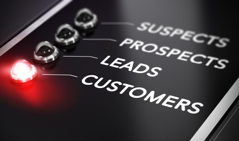
Your website needs to get visitors. And from those visitors, it needs to get the highest percentage of qualified leads possible that turn into paying customers and clients for your business! Without this key design element, all of the money and all of the work that was put into your business website will be wasted.
You might be saying, “That’s great! But what are the tricks for making this happen for MY business website?”
You need a ‘highly converting website,’ not just another pretty website. This type of website takes your visitors through an experience, as long or short as it needs to be for your business, and presents them with not only the the best reasons to contact you to become a new customer (or buy right then and there for an eCommerce site), but also gives them the easiest ways possible to do this. Any friction in the process will result in lost conversion opportunities. Keep it simple and easy!
Differences Between Highly Converting Websites and Ordinary Websites
What’s the difference between a highly converting website and a low (or non) converting website? All those aspects that were mentioned earlier help considerably, but they don’t mention the most important aspects that help a web page convert! Notice here that I said web page, versus website. EVERY web page that people go to on your website, whether they found you on Google or Bing (for example) from organic listings, Pay Per Click, or from any other website, must be built to convert highly. Then you’ll have a highly converting web SITE.
Now here’s the really good stuff…
Each page on the website has to answer each of the following 3 very simple questions within 8 seconds of someone arriving on the page, in the eyes of the visitor, or that person will be off to the next website that will answer them quickly:
- Where am I? To clarify – what’s the business name, what does the business do and/or what products are available, and/or does this web page have the information I’m looking for?
- What can I do here? The real question is – can I do what I am looking to do? Whether that’s buy a product, hire a service, or get information? Are there call to action buttons that help me proceed to the next buying step?
- Why should I do it? Are there statements about why this product does what it says it does, or social proof or awards, for example? Can I TRUST that what it says is true and be reasonably sure that if I spend my money (or time) that I will get what I came to get?
The Highly-Converting Website Do-It-Yourself Test
Try this for yourself – do a search for something on the Internet. For example, look for a plumber in your local area. Pretend your toilet is leaking. Look at the plumber’s pages that you’re arriving at. Then look at all those 3 simple questions. You’re going to find that about 90% of the web pages you go to will NOT answer those questions quickly and easily in 8 seconds.
Why is that?
- Because most website designers are more focused on pretty, cute, and other design aspects that have nothing at all to do with conversion. You don’t need pretty or cute to convert. I’m not saying that pretty and cute CAN’T convert. But, the website must take conversions into account FIRST, above and beyond any other design considerations,
- And, most SEO’s and PPC’s are focused on getting traffic for the website, not converting the traffic to paid customers and clients. SEO’s will show you the traffic reports, which are well and good. But the real question you want answered is – how much more business did I get from that traffic?
What good does it do if you have the prettiest or most beautiful website in the world and then attract paid and organic traffic to it, if it fails to convert those visitors? Your website must give people the information they’re looking for, quickly. It must make them feel like they can trust your business to deliver as you say you will. People do business with people and businesses they know, like, and trust.
Your website must give your visitors the feeling that they can – know, like, and trust – your business, and you. Big brands have that advantage. Small businesses in most cases don’t have that advantage, and therefore must use other methods to convert website traffic to paid business.
Now you see why CRO is so important, right? Here’s a question for you: has your website been converting visitors to customers, or could it use some help?
If your website needs help converting visitors, contact us today at 800-590-2085 – we can help you evaluate your web pages and increase your conversion rates so you get more customers paying you for your products and services.

